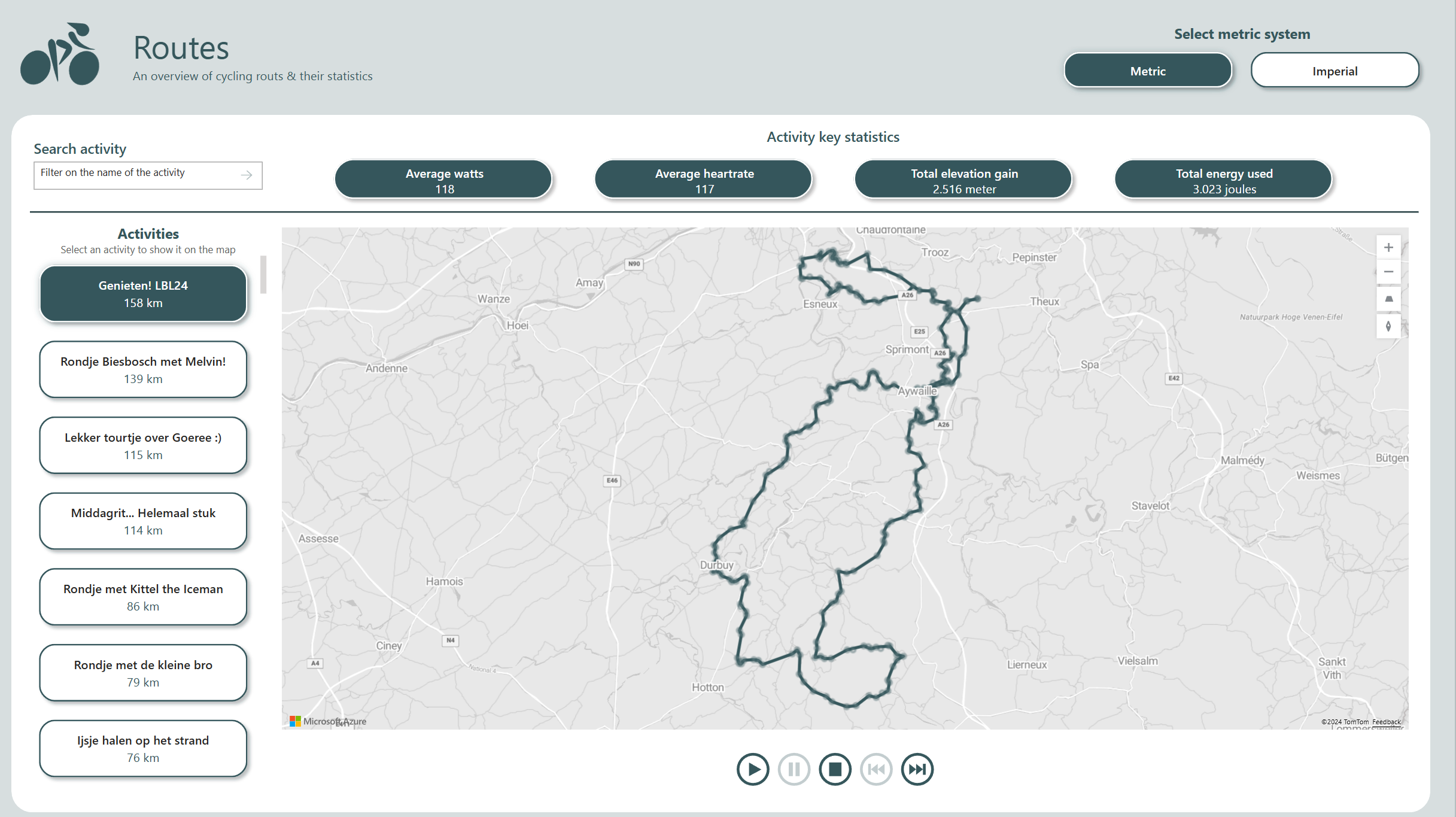
Cycling data on a map
The Power BI team has been doing some awesome work lately with the Azure Maps Visual. We got a new feature in the maps visual that allows us to show routes on the map. In the example, funny enough a route of a ferry from Vancouver to Vancouver Island I have been on myself, you can see the dots being connected. This gave me the idea to try this out myself with my own cycling data! I want to have […]

